
Direct Answer: How to Optimize WordPress Images for Mobile Performance
To optimize WordPress images for mobile devices effectively, resize images to match mobile screen dimensions, compress images without visible quality loss, and implement lazy loading so that images load only when needed. Combining these techniques reduces page load time, conserves bandwidth for mobile users, and improves overall user experience.
Prerequisites and Safety Checks Before Optimization
- Backup Your Website: Before making changes, create a full backup of your WordPress site files and database. This ensures you can restore your site if an issue occurs during optimization.
- Know Your Mobile Target Dimensions: Understand the typical screen sizes of your main mobile audience to set appropriate image dimensions.
- Check Current Image Usage: Identify all the images on your site that appear on mobile, including featured images, content images, backgrounds, and sliders.
- Install a Child Theme (Optional but Recommended): If you will be modifying theme files for custom lazy loading or responsive image markup, use a child theme to avoid losing changes after updates.
Step 1: Resize Images for Mobile Devices
Serving images at unnecessary large resolutions wastes bandwidth and slows page speed, especially on mobile devices. Images should be resized to the exact or near the maximum display size on mobile screens.
- Determine Max Mobile Width: Often 320–480 pixels wide is sufficient for mobile images.
- Batch Resize Existing Images: Use image editing software or WordPress plugins that can batch resize images.
- Example Plugin: The
Regenerate Thumbnailsplugin can help you recreate properly sized thumbnails after setting new image sizes.
- Example Plugin: The
- Set WordPress Image Sizes: In the
functions.phpfile, ensure sizes include a mobile-appropriate setting.add_image_size( 'mobile', 480, 9999 ); // max width 480px, unlimited height - Use Responsive Image Markup: WordPress 4.4+ automatically adds
srcsetattributes to images to serve the best available size depending on screen width.
Step 2: Compress Images Without Losing Quality
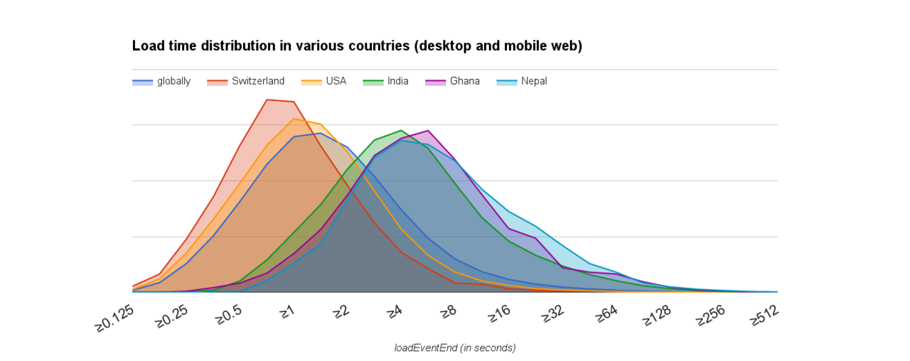
After resizing, compress images to reduce file size. Compression can be lossy (some detail loss) or lossless (no visible loss but less compression).
- Use Plugins for Automatic Compression:
- Popular Options: ShortPixel, Smush, EWWW Image Optimizer, and Imagify.
- These plugins optimize images on upload and optionally bulk optimize existing images, balancing file size and quality.
- Choose Effective Compression Settings:
- For JPEGs, aim for 70–80% quality.
- For PNGs, apply lossless compression or convert to WebP format if supported.
- Serve Modern Image Formats:
- Use tools or plugins that convert images to WebP, which offers smaller file sizes and good quality, improving load speeds on supported browsers.
Step 3: Implement Lazy Loading for Mobile
Lazy loading defers image loading until they appear in the viewport, reducing initial page weight on mobile. WordPress versions 5.5 and later include native lazy loading support, but you can customize or enhance it.
- Ensure Native Lazy Loading is Enabled: WordPress adds the
loading="lazy"attribute automatically to images. Verify with the browser dev tools. - Use a Plugin for Enhanced Control:
- Plugins like Lazy Load by WP Rocket or a3 Lazy Load provide advanced options including-placeholder images, custom selectors, and video lazy loading.
- Manual Implementation (Optional): For themes without native support, add the attribute manually or enqueue a JavaScript lazy load library.
// Example filter to add lazy loading if not present
add_filter( 'wp_lazy_loading_enabled', '__return_true' );
Additional Best Practices to Enhance Mobile Image Performance
- Use a Content Delivery Network (CDN): CDNs deliver images from servers closer to users, speeding up load times worldwide.
- Leverage Browser Caching: Set cache headers to prevent repeated downloads of unchanged images.
- Limit the Number of Images on Mobile Pages: Avoid image-heavy designs or use accordions and tabs to hide images unless viewed.
- Set Image Dimensions in HTML/CSS: Specify width and height to prevent layout shifts during loading.
Verifying Success After Optimization
- Page Speed Testing Tools: Use Google PageSpeed Insights, GTmetrix, or WebPageTest to analyze mobile performance improvements, focusing on image-related metrics.
- Inspect HTML Image Markup: Check for
srcsetandloading="lazy"attributes via browser developer tools. - Check Image File Sizes: Confirm images are served compressed and resized appropriately.
- Test on Actual Mobile Devices: Ensure images render crisply and load quickly without blocking content.
Common Mistakes to Avoid
- Uploading Oversized Images: Starting with very large files negates compression and slows rendering.
- Over-Compression: Using aggressive compression reduces quality noticeably, hurting user experience.
- Failing to Enable Responsive Images: Not using
srcsetmeans mobile users download desktop-size images unnecessarily. - Ignoring Lazy Loading: Especially on long pages, not deferring offscreen images increases initial load times.
- Relying Solely on Plugins Without Evaluation: Plugin defaults may not suit every site; test settings thoroughly.
Useful Alternatives and Plugins for Image Optimization on Mobile

| Plugin Name | Main Feature | Mobile Benefit |
|---|---|---|
| Smush | Automatic image compression and lazy loading | Reduces image sizes for mobile without quality loss, improves load speed |
| ShortPixel | Compresses and converts images to WebP | Smaller images improve mobile bandwidth usage and page speed |
| Imagify | One-click optimization and WebP support | Delivers light images optimized for mobile viewing |
| Lazy Load by WP Rocket | Advanced lazy loading option for images and iframes | Speeds up mobile page load by deferring image downloading |
Short FAQs
1. Does WordPress resize images automatically?
Yes, WordPress generates multiple image sizes upon upload for responsive use, but you may need to adjust sizes or regenerate thumbnails for mobile-specific dimensions.
2. Is lazy loading compatible with all browsers?
Native lazy loading is supported in most modern browsers. For wider compatibility, using a lazy loading plugin that provides JavaScript fallbacks is recommended.
3. Should I convert all images to WebP?
WebP often reduces size effectively but may not be supported by all browsers. Many plugins serve WebP conditionally and fallback to JPEG/PNG.
4. Will image optimization affect SEO?
Optimizing images to load faster improves page speed, which is a ranking factor. Proper use of alt text and descriptive file names maintains SEO benefits.
5. How often should I optimize images?
Optimize images on upload automatically via a plugin, and periodically bulk optimize existing images if you make changes to optimization settings.
Screenshot Suggestions
- WordPress Media Library with an example of using the Regenerate Thumbnails plugin interface to resize images.
- Settings page of an image optimization plugin like Smush showing compression and lazy loading toggles.
- Google PageSpeed Insights mobile report highlighting image optimization opportunities before and after optimization.
- Browser developer tools highlighting
loading="lazy"attribute in image HTML tag.
Troubleshooting Common Issues in Mobile Image Optimization
Even after following best practices to optimize images for mobile performance on WordPress, it’s possible to encounter issues that negate the benefits or cause display problems. Here are common problems and how to address them:
- Images Not Displaying After Compression: This usually happens if compression corrupts files or plugins fail during optimization. To fix:
- Restore original images from your backup.
- Check plugin settings to avoid over-aggressive compression levels.
- Test compression on a copy of a single image before bulk operations.
- Lazy Loading Causing Image Flicker or Layout Shifts: This occurs if image dimensions are not specified or the lazy loading script conflicts with theme JavaScript.
- Set explicit width and height attributes in the image HTML to reserve space.
- Disable other lazy load plugins to identify possible conflicts.
- Update all involved plugins and themes to latest versions.
- Incorrect Image Sizes Served on Mobile: Sometimes
srcsetisn’t working properly leading to desktop-sized images on mobiles.- Ensure responsive image markup isn’t disabled by the theme or plugins.
- Verify image sizes registered in
functions.phpcover mobile resolutions. - Regenerate thumbnails after modifying image sizes.
- WebP Images Not Displaying on Some Browsers:
- Confirm browser support for WebP; use fallback JPEG/PNG as needed.
- Use compatible plugins that serve WebP conditionally.
Verifying Mobile Image Optimization: Detailed Steps
Ensuring that your mobile image optimization efforts are effective requires both automated tools and manual verification:
- Run Google PageSpeed Insights for Mobile:
- Enter your site URL and analyze the mobile tab.
- Check “Properly size images” and “Serve images in next-gen formats” sections for recommendations.
- Confirm optimized images are reflected in the score improvement compared to before optimizing.
- Inspect Image Attributes in Your Mobile Browser:
- Using browser developer tools (Chrome DevTools with Mobile Emulation enabled), inspect individual images.
- Look for
srcsetattribute showing multiple resolutions for responsive delivery. - Verify
loading="lazy"attribute on images to confirm lazy loading is active. - Confirm width and height attributes to avoid layout shifts.
- Manually Test Load Speed on Mobile Devices:
- Use physical mobile devices or browser emulators to experience real-world load times.
- Observe if images load progressively without blocking page content.
- Ensure clarity and sharpness of images; over-compression may cause noticeable blurring.
- Check Image File Sizes and Formats:
- Open image URLs in a browser tab and inspect file information (right-click and “Open image in new tab”), checking its format (JPEG, WebP, PNG) via file extension or network analysis.
- Confirm file sizes are significantly smaller than the original uploads.
FAQ: Advanced Questions on Optimizing WordPress Images for Mobile
Q: Can I automate image resizing for different mobile screen sizes?
Yes, WordPress’ built-in responsive images feature creates multiple image sizes and uses the srcset attribute to serve the best image based on device viewport. You can extend this by adding extra image sizes in your theme and regenerating thumbnails.
Q: How do I handle background images in CSS for mobile optimization?
Background images often don’t benefit from lazy loading or responsive srcset automatically. To optimize:
- Use media queries to serve smaller background images for mobile screen sizes.
- Use CSS image sprites or inline SVGs when appropriate.
- Where possible, replace decorative background images with CSS effects to reduce image use.
Q: Are there any risks using WebP for mobile images?
While WebP offers superior compression, compatibility issues exist with older browsers and some platforms. Use plugins that implement conditional loading to serve WebP to supported browsers and fallback JPEG or PNG to others, avoiding broken images.
Q: What if my theme doesn’t support native lazy loading?
You can add native lazy loading by enabling WordPress filters or enqueue JavaScript lazy loading libraries manually. Additionally, plugins like Lazy Load by WP Rocket can add lazy loading easily without modifying theme code.
Q: How much bandwidth savings can I realistically expect on mobile?
The savings depend on original image size and quality settings, but combining resizing, compression, lazy loading, and WebP conversion can reduce mobile image payloads by 30-70%, significantly improving speed.
Summary and Next Steps
Optimizing WordPress images for mobile performance involves a multipronged approach: resizing to suitable dimensions, compressing files effectively, leveraging modern formats like WebP, implementing lazy loading, and verifying optimizations with proper tools. Avoiding common pitfalls and staying mindful of the diversity of mobile devices and browsers ensures the best user experience.
After completing the steps outlined, regularly monitor your site’s mobile speed and image delivery quality as part of ongoing maintenance, updating plugins and optimization settings as needed.
For deeper performance gains, consider combining image optimization with global optimization strategies such as minifying CSS/JS, caching, and server-side optimizations.


